Words - Tables - Graphs
Alignments to Content Standards:
F-IF.B.4
Task
Below are 4 verbal descriptions, 3 graphs, and 3 tables of values. Match each of the following descriptions with an appropriate graph and table of values. Create the missing graph and the missing table of values.
1. The weight of your jumbo box of cereal decreases by an equal amount every week.
2. The value of the bicycle depreciated rapidly at first, but its value declined more slowly as time went on.
3. The tennis ball is dropped off the roof of a skyscraper.
4. For a while it looked like the decline in profits was slowing down, but then they began declining more rapidly.
A.
|
x |
0 |
1 |
2 |
3 |
4 |
5 |
|
y |
400 |
384 |
336 |
256 |
144 |
0 |
B.
|
x |
0 |
1 |
2 |
3 |
4 |
5 |
|
y |
400 |
184 |
98 |
63 |
49 |
43 |
C.
|
x |
0 |
1 |
2 |
3 |
4 |
5 |
|
y |
400 |
253 |
218 |
216 |
181 |
34 |


IM Commentary
The purpose of the task is to show that graphs can tell a story about the variables that are involved. Together with tables of values, they can paint a complete picture of a situation. These tasks all describe situations for which the given quantity is decreasing. In order to distinguish the situations, students will have to think about the rate at which the quantities are decreasing over time. Teachers could ask students to think through the task individually for a few minutes at first, constructing arguments to justify why they are selecting the graph and table to match the scenario. Then students could partner to compare their work and critique each other’s arguments. If possible, teachers could assign the individual work as homework so that students come to class ready to partner and compare their work. The variables are given but not their units. Depending on where this task lies in a unit of study on functions, the teacher could ask students to define the variables and units x and y for each situation. In addition, the teacher could ask students to think about the end behavior for each situation and justify how the graph plays out in terms of the context.
The fourth description can be challenging for students. The teacher could change the quantity to make it easier for students to understand or decide to leave out this part, if necessary.
Solution
Description 1 indicates a constant rate of change. The graph must be (III), since the line has a constant rate of change. The table must show a change for each time interval of 1 as the same. In the table shown below, the change for each time interval of 1 is 80.
|
x |
0 |
1 |
2 |
3 |
4 |
5 |
|
y |
400 |
320 |
240 |
160 |
80 |
0 |
(x represents time in weeks. y represents weight, probably in grams, at least that would fit best with the numbers.)
Description 2 indicates a rapid change and then a slow change. The table must be (B), since the change in each interval of 1 decreases as x increases. The graph must drop quickly and then slow, as shown below.

(x represents time, in years (makes most sense) y represents value in dollars (could be other currencies))
Description 3 indicates a slow change and then a rapid change. The graph must be (I), since it decreases slowly at first and then drops quickly. The table must be (A), since the change in each interval of 1 increases as x increases.
(x represents height in meters of feet y represents time, in seconds (makes most sense))
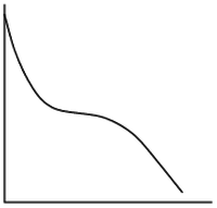
Description 4 indicates a quick change then a slow change and then a quick change. The graph must be (II), since the graph drops quickly, then steadies for a short while, and then drops quickly again. The table must be (C), since the change in each interval of 1 is large, then small, and then large again.
(x represents time, the units are not given and could vary, i.e. days, weeks, years are all possible. y represents profit in dollars, (could be different currency or method to measure profits))
Words - Tables - Graphs
Below are 4 verbal descriptions, 3 graphs, and 3 tables of values. Match each of the following descriptions with an appropriate graph and table of values. Create the missing graph and the missing table of values.
1. The weight of your jumbo box of cereal decreases by an equal amount every week.
2. The value of the bicycle depreciated rapidly at first, but its value declined more slowly as time went on.
3. The tennis ball is dropped off the roof of a skyscraper.
4. For a while it looked like the decline in profits was slowing down, but then they began declining more rapidly.
A.
|
x |
0 |
1 |
2 |
3 |
4 |
5 |
|
y |
400 |
384 |
336 |
256 |
144 |
0 |
B.
|
x |
0 |
1 |
2 |
3 |
4 |
5 |
|
y |
400 |
184 |
98 |
63 |
49 |
43 |
C.
|
x |
0 |
1 |
2 |
3 |
4 |
5 |
|
y |
400 |
253 |
218 |
216 |
181 |
34 |