F-IF From the flight deck
Alignments to Content Standards:
F-IF.B.4
Task
This task is in the form of classroom instructions; it is not intended to be distributed to students.
Introduce the video below with “Watch this very brief video and observe as much of what is happening as possible.”
(0:19)
Suggested format for the questions below: Table/desk groups of around 4; discuss each question with group, then select some responses for the whole class to hear and discuss.
After showing:
-
What are some things that you think you might be able to find on that plane’s instrument panel?
-
This flight was about 3½ minutes long. Graph your best guess for one of the quantities that you identified in #1 over the course of the entire flight (not just the portion in the brief video).
Here is the instrument panel during the same takeoff:
(0:19)
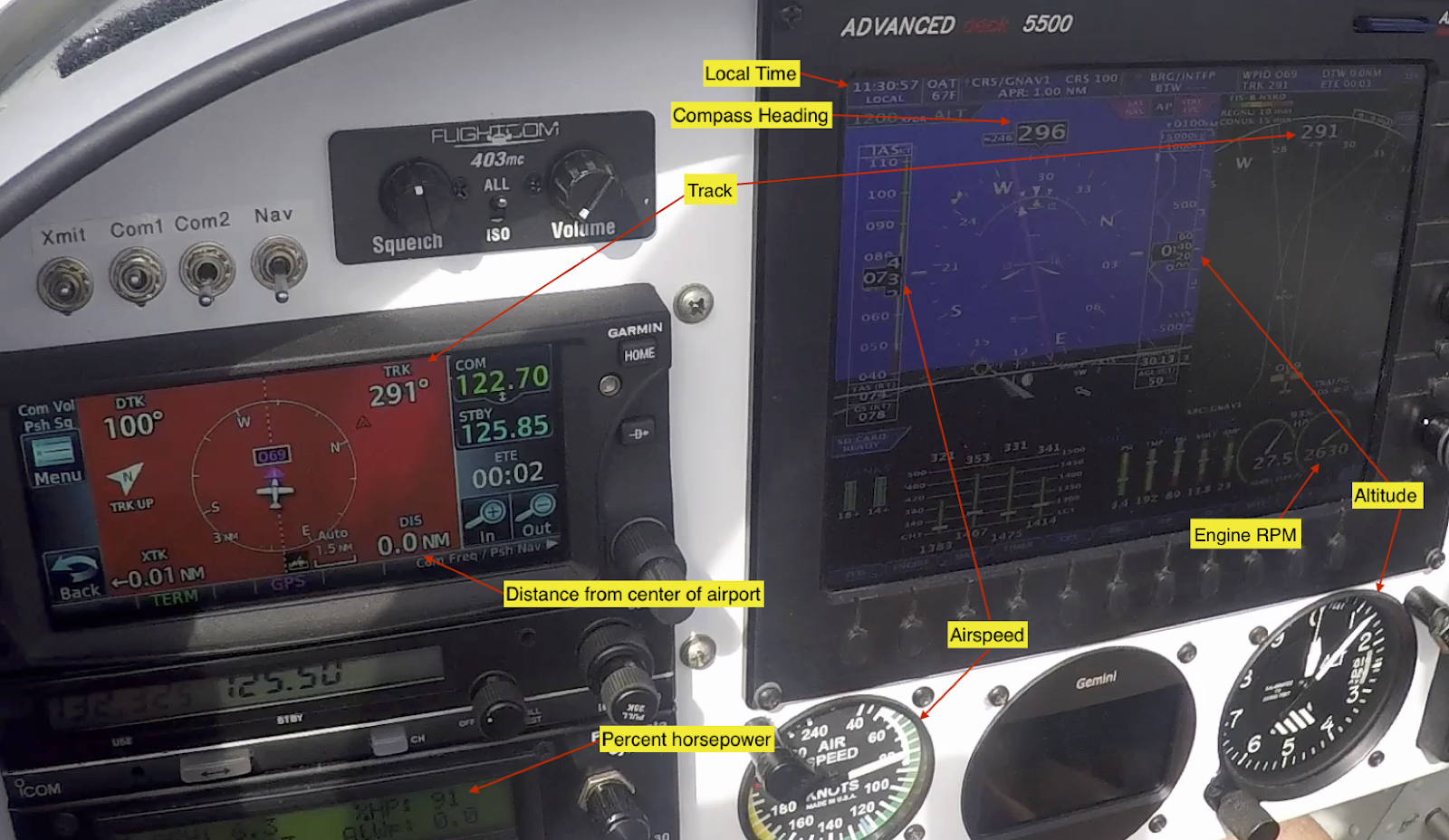
As the above shot may be difficult to make out all the details, here is a clearer photo of the same model display, in a slightly different mode:

-
Attempt to identify as many of the instruments on the panel as you can.
The students might ask about some of the abbreviations. You should feel free to reveal if asked.
-
IAS: indicated airspeed, read directly from the plane’s airspeed instrument
-
DIS: distance from center of the airport
-
NM: nautical mile, approximately 1.151 mile
-
Knots: nautical miles per hour, 1 knot is approximately 1.151 mph
-
Track: orientation of the plane’s track (0˚ means heading straight North)
-
Heading: direction the plane’s nose is pointing (may differ from track due to wind)
-
OAT: outside air temperature (on the panel next to local time)
Be certain that students have figured out where to read the time off of the instrument panel. Show the instrument panel video again, posing the question below:
-
Watch the video again, this time to figure out what time it was when the plane lifted off. Convince me!
(0:19)
After groups decide on a time estimate, show the following video to check how close they got with their “liftoff” estimates
(0:25)
-
Now work on making your graph from #2 more precise and accurate. First, add some units to your graph.
-
What are some pieces of information that would help you improve your graph?
Share any of the following that are requested:
-
Units for altitude: feet
-
Maximum altitude 990 feet
-
Time of maximum altitude: 11:32:08-11:32:14
-
Landing time: 11:33:58
-
Maximum airspeed 122 knots, at 11:32:16
-
Now you’ll see a video of the instrument panel through the whole flight. What do you want to watch for to improve your graph as much as possible?
Now show the whole flight: (1:08)
Allow the class to see the video up to two more times. Offer to pause at pre-determined times (up to three times), to get readings off the instruments.
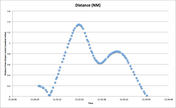
Select/Sequence/Connect ideas from student groups’ graphs as appropriate to ensure that all students develop their understanding of the ideas in HSF-IF.B.4 (see commentary, below for possible answers and discussion questions). For example, if groups of students or individual students created graphs of the same quantities, several graphs could be compared to discuss differences and similarities. Different students might have used different scales, which would cause graphs to look different but show maxima and minima at the same time stamp or slopes might look steeper but have the same values. Comparing graphs also gives the teacher a chance to ask about prominent features, for example, for the altitude graph the vertical intercept represents the altitude of the airport above sea level, or the maximum on the distance traveled graph shows furthest distance away from the airport that the plane has traveled. More questions could be raised: When was the plane 0.8 miles away from the airport?
IM Commentary
This task is aimed at the development of standard F-IF.B.4 in the context of a somewhat constrained modeling problem.
HSF-IF.B.4
For a function that models a relationship between two quantities, interpret key features of graphs and tables in terms of the quantities, and sketch graphs showing key features given a verbal description of the relationship. Key features include: intercepts; intervals where the function is increasing, decreasing, positive, or negative; relative maximums and minimums; symmetries; end behavior; and periodicity.
The context of the airplane flight presents several quantities from which to choose. Question 2 identifies the independent variable as time, though some students might wonder about other relationships (for example, “Does it get colder as we go up?”)
The Common Core State Standards (CCSS) modeling cycle (in the introduction to the high school modeling standards) involves all of these activities:
-
identifying variables in the situation and selecting those that represent essential features,
-
formulating a model by creating and selecting geometric, graphical, tabular, algebraic, or statistical representations that describe relationships between the variables,
-
analyzing and performing operations on these relationships to draw conclusions,
-
interpreting the results of the mathematics in terms of the original situation,
-
validating the conclusions by comparing them with the situation, and then either improving the model or, if it is acceptable, reporting on the conclusions and the reasoning behind them.
This task is designed to focus on steps 1, 2 (with a focus on graphical representations), and 5.
This annotated instrument panel shows you the most important quantities that can be read from the instrument panel:
Setup
In order to preserve the intended focus on modeling step 1 (identifying variables/quantities), it is important to leave the beginning of the task fairly undirected. For example, giving a list of possible quantities to find on the instrument panel would remove this step from the task.
The same idea holds throughout: The project is designed for students to decide what quantities about which to gather data, briefly predict what they expect (by sketching a graph), then gather the data and refine their graphs. Give as much opportunity as possible for students to share and explain their graphs with you and each other, and to give feedback and revise.
A few quantities are labeled on the panel (the lower airspeed indicator – in knots; “ALT” for altitude on the lower altitude indicator); others are harder to make out and it may help to watch the second video to see the indicators changing during takeoff.
in the solution is a brief discussion of some of the quantities that students might choose to graph.
Solution
Altitude
Here is the graph of the altitude as measured by the plane’s altimeter:

Questions to consider:
-
Why does the graph never get to “0”? [If students pay attention to the introductory video, they can see that “altitude” is greater than 0 even when the plane is on the ground. Why? Altitude is measured in feet above sea level; the airport used is at 87 feet above sea level.]
-
What would you expect it to look like for a longer flight? What might be similar? [Slope of ascent, slope of descent] What might be different? [maximum; time at maximum altitude]
Airspeed
Here is the actual airspeed graph for this flight:

Questions to consider:
-
Does this match what you expected? Does it match what you observed on the panel? [Some students may expect airspeed to be greater on the descent (second half of the flight), which would match their experience in cars or on bicycles. However, airplanes need speed to generate lift, so speed can be slower when gliding on the descent than during the ascent.]
-
Why does the airspeed drop so much after the peak? [Once the high speed is no longer necessary to generate lift to climb, the pilot eased off the throttle to save gas and enjoy the ride]
Questions to consider:
-
Can you explain the shape in the middle of the graph? [The plane headed away from the airport after takeoff and then came back around to land in the same direction it took off, so it passed closer to the airport while circling back.]
-
What is the down-and-back-up at the beginning of the graph? [During takeoff, the plane crossed the point which is listed as the center of the airport at 11:30:57 (see video or instrument panel still shot)]
Heading and Track
The heading is the direction the nose of the plane is pointing. It may differ slightly from the “track” (which is the direction the plane is actually moving) because wind may mean the pilot has to point the plane slightly towards the wind to get the plane to move in the desired direction.
Here are both quantities graphed together on one set of axes.
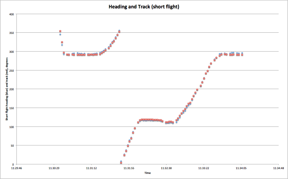
Questions to consider:
-
What’s the discontinuity about?
-
(If groups choose both Track and Heading) Can you spot any differences between the graphs? [Working from actual graph above: The track is higher around 100 degrees of heading; the heading is greater around 300 degrees.]
-
Could you use either of these graphs to plot the course of the plane? If not, what else would help? [Given just these data, it’s not possible to plot the course; but given speed data as well, it would be possible; though actually working out the course of the plane is a whole different project.]
-
Can you tell what direction the wind was blowing from this graph? [This is hard: The track is greater when the plane is traveling approximately East (90°), indicating that the wind is pushing the plane a bit to the south (higher compass reading) of the heading. Similarly, when the plane is traveling West (270°), the track is less than the heading (again, the track is pointing more south) , indicating that the wind is pushing the plane southward. We conclude that the wind was approximately from the north]
Temperature
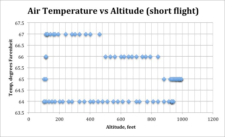
“OAT” on the instrument panel is outside air temperature. Students may expect this to show a significant relationship to altitude, but it doesn’t actually change much over the course of this flight. Here is air temperature vs time and vs altitude for the short flight:

Questions to consider:
-
When looking at the temperature-vs-time graph, why does the temperature seem to jump (exhibit discontinuity) rather than changing smoothly? [The instruments only record temperature to the nearest whole degree, so this is an artificial result of the instrumentation, rather than a real phenomenon.]
-
Does the temperature appear to have a consistent relationship with altitude? In other words, knowing the altitude, could you tell me the temperature? [Note that the temperature on the way down (towards the end of the flight) is lower than the temperature on the way up, there is not a consistent – that is, a functional – relationship between temperature and altitude]
-
On the temperature vs altitude graph, the vertical line at altitude 400 seems to pass through data points at both 64° and 67°. Is this possible? What might explain it? [The temperature was 67° at 400 feet on the way up, and 64° at 400 feet on the way down. It is not possible from this graph alone to tell which was on the way up and which on the way down, but looking at both temperature graphs together would give enough information to tell this.]
For comparison, here is a scatterplot of air temperature vs altitude for a slightly longer flight on the same day. It does show a cooling at higher altitudes. Again, however, we see that air temperature is not a function of altitude: For each altitude, it appears that there are two different temperature readings (one on the way up, one on the way down)

Propeller speed/Engine speed
The propeller is directly connected to the engine shaft, so propeller speed and engine speed are the same.

Questions to consider:
-
Can you explain the bump above 2500 revolutions per minute near the beginning of the graph? [Full power - maximum acceleration - is needed for takeoff]
-
Explain other features of the graph in terms of what was happening in the flight. [e.g. The propellor speed is constant during the climbing phase of the flight; drops during gliding/descending phase of flight; speeds up for a bit during approach to create soft landing; drops off after landing as it’s no longer needed]
Horsepower
Horsepower is recorded as a percent of the maximum that the engine is capable of delivering.

Questions to consider:
-
Can you explain the general shape of this graph? In particular:
-
Why is it highest from about 11:30:52 to 11:31:08? [Takeoff requires maximum power]
-
How can the bump from about 11:33:36 to 11:33:54 be explained? [Landing requires some power from the engine to land at a small angle to the runway]
-
Why is the value so low during the second half of the flight? What might the airplane have been doing during that time? [Essentially gliding – very little engine power required to keep the plane aloft – it was descending for most of this time]
-
F-IF From the flight deck
This task is in the form of classroom instructions; it is not intended to be distributed to students.
Introduce the video below with “Watch this very brief video and observe as much of what is happening as possible.”
(0:19)
Suggested format for the questions below: Table/desk groups of around 4; discuss each question with group, then select some responses for the whole class to hear and discuss.
After showing:
-
What are some things that you think you might be able to find on that plane’s instrument panel?
-
This flight was about 3½ minutes long. Graph your best guess for one of the quantities that you identified in #1 over the course of the entire flight (not just the portion in the brief video).
Here is the instrument panel during the same takeoff:
(0:19)
As the above shot may be difficult to make out all the details, here is a clearer photo of the same model display, in a slightly different mode:
-
Attempt to identify as many of the instruments on the panel as you can.
The students might ask about some of the abbreviations. You should feel free to reveal if asked.
-
IAS: indicated airspeed, read directly from the plane’s airspeed instrument
-
DIS: distance from center of the airport
-
NM: nautical mile, approximately 1.151 mile
-
Knots: nautical miles per hour, 1 knot is approximately 1.151 mph
-
Track: orientation of the plane’s track (0˚ means heading straight North)
-
Heading: direction the plane’s nose is pointing (may differ from track due to wind)
-
OAT: outside air temperature (on the panel next to local time)
Be certain that students have figured out where to read the time off of the instrument panel. Show the instrument panel video again, posing the question below:
-
Watch the video again, this time to figure out what time it was when the plane lifted off. Convince me!
(0:19)
After groups decide on a time estimate, show the following video to check how close they got with their “liftoff” estimates
(0:25)
-
Now work on making your graph from #2 more precise and accurate. First, add some units to your graph.
-
What are some pieces of information that would help you improve your graph?
Share any of the following that are requested:
-
Units for altitude: feet
-
Maximum altitude 990 feet
-
Time of maximum altitude: 11:32:08-11:32:14
-
Landing time: 11:33:58
-
Maximum airspeed 122 knots, at 11:32:16
-
Now you’ll see a video of the instrument panel through the whole flight. What do you want to watch for to improve your graph as much as possible?
Now show the whole flight: (1:08)
Allow the class to see the video up to two more times. Offer to pause at pre-determined times (up to three times), to get readings off the instruments.
Select/Sequence/Connect ideas from student groups’ graphs as appropriate to ensure that all students develop their understanding of the ideas in HSF-IF.B.4 (see commentary, below for possible answers and discussion questions). For example, if groups of students or individual students created graphs of the same quantities, several graphs could be compared to discuss differences and similarities. Different students might have used different scales, which would cause graphs to look different but show maxima and minima at the same time stamp or slopes might look steeper but have the same values. Comparing graphs also gives the teacher a chance to ask about prominent features, for example, for the altitude graph the vertical intercept represents the altitude of the airport above sea level, or the maximum on the distance traveled graph shows furthest distance away from the airport that the plane has traveled. More questions could be raised: When was the plane 0.8 miles away from the airport?